


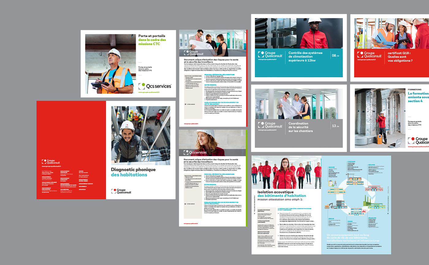
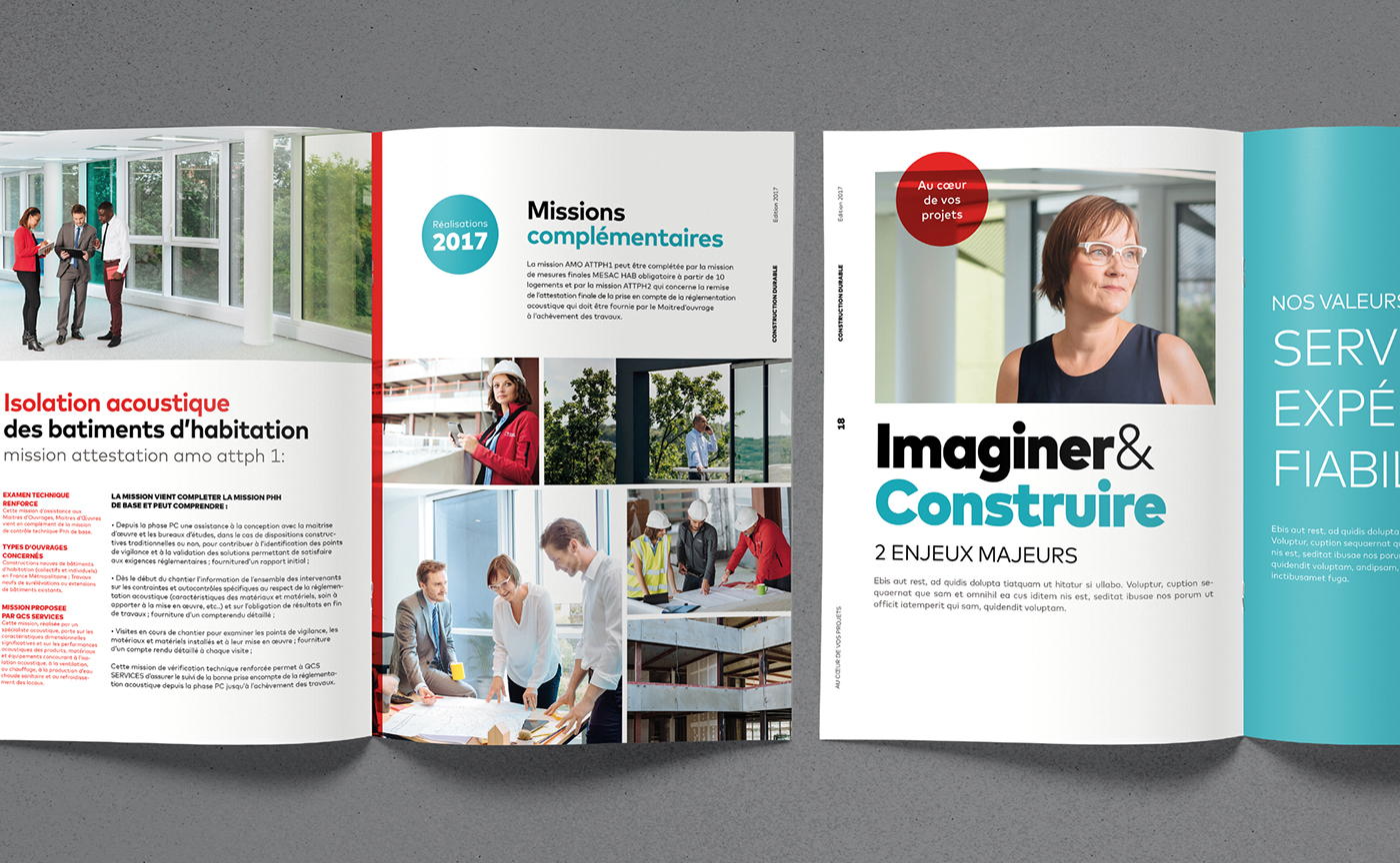
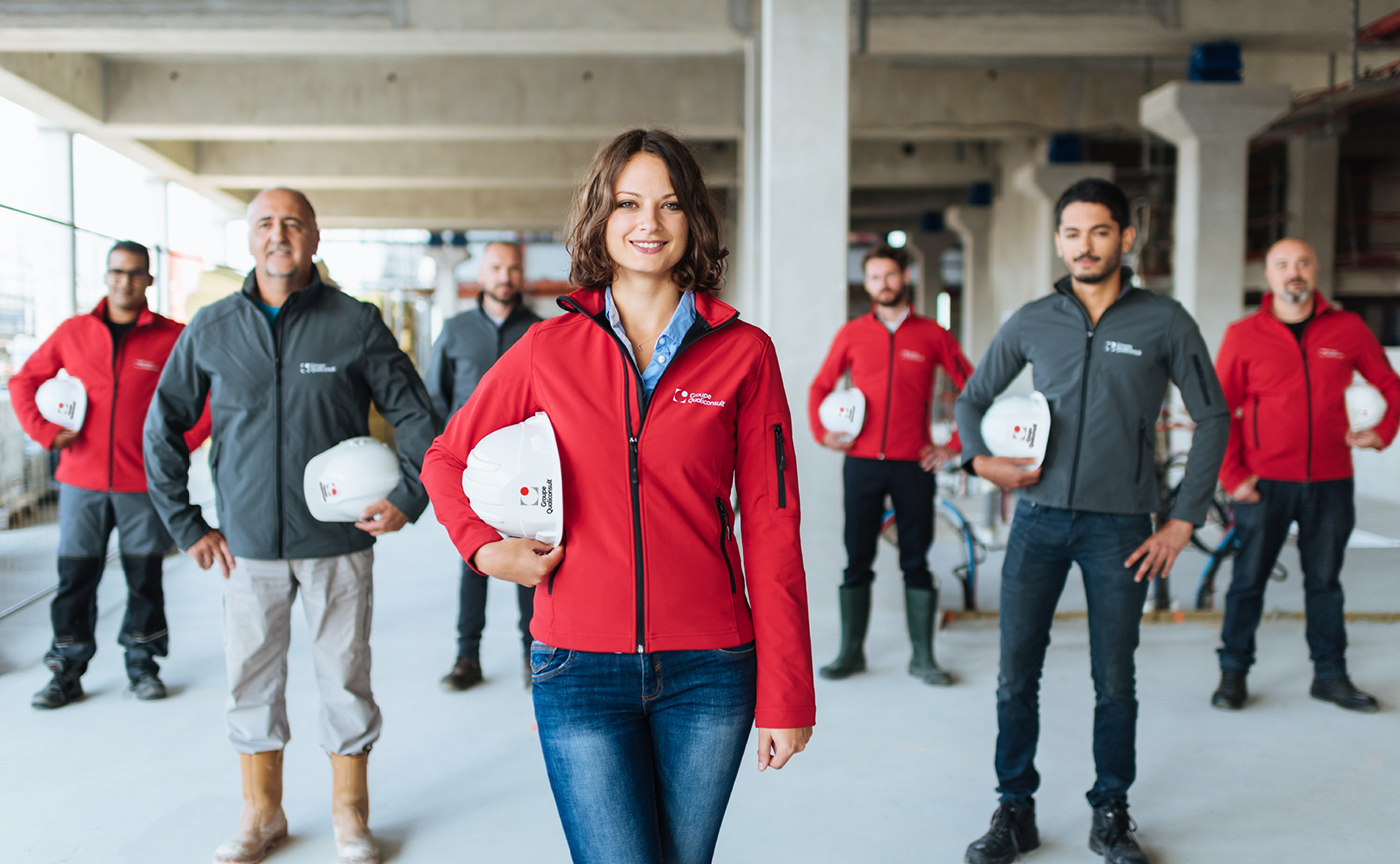
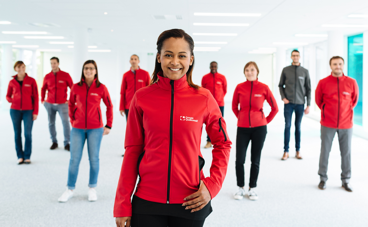
Groupe Qualiconsult new Brand identity
A logotype that evolves to strengthen Groupe Qualiconsult brand awareness, and that allows the brand identity to fit better to the new digital aera of communication.
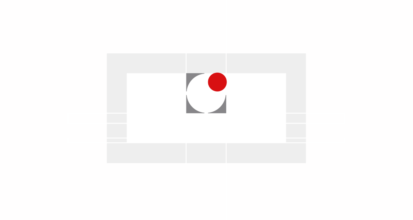
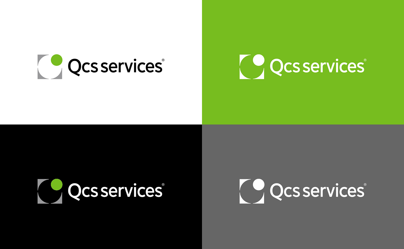
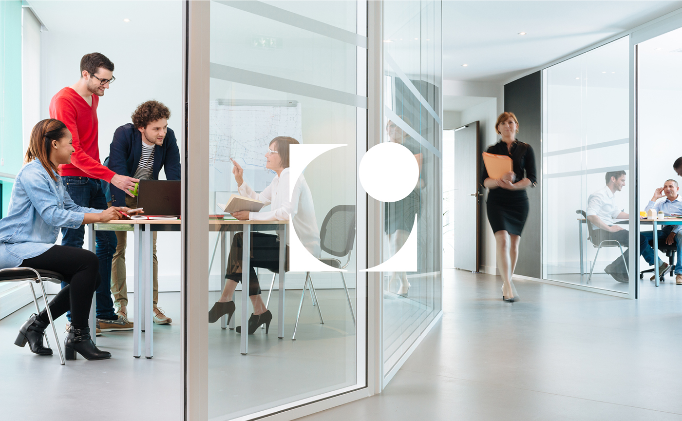
A new symbol that preserves the DNA of the historic emblem while installing a clearer and more functional geometric design.
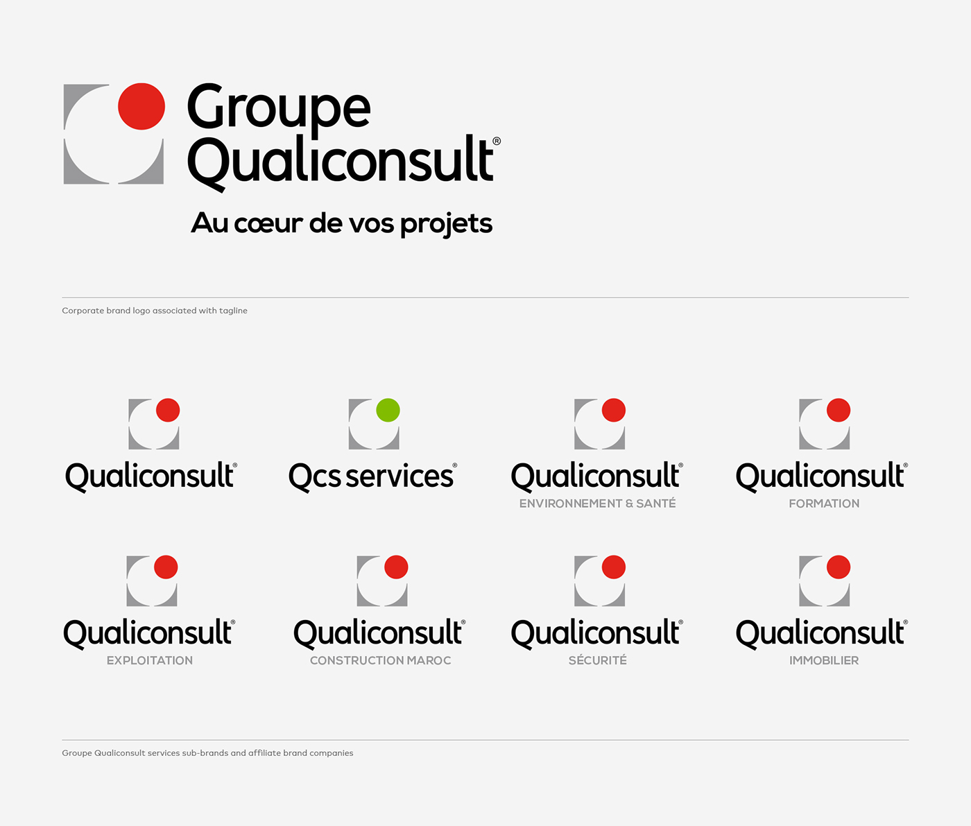
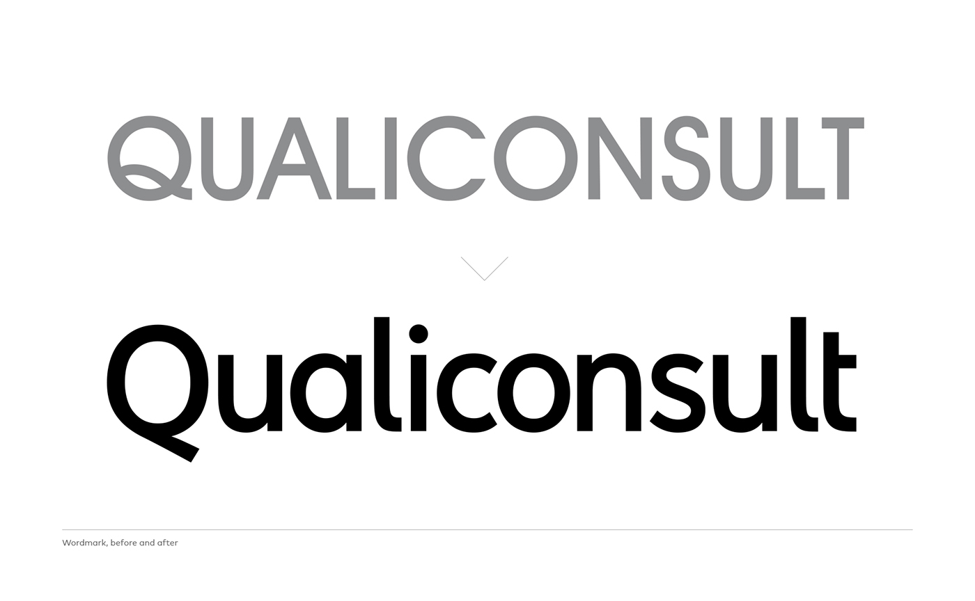
A new wordmark that imposes the name Qualiconsult in a more readable and impactful way.
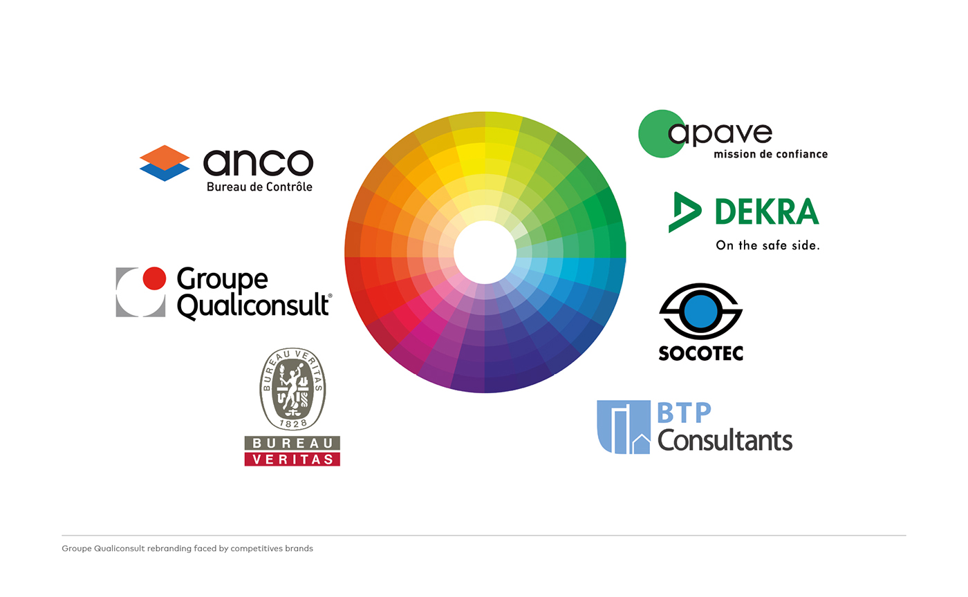
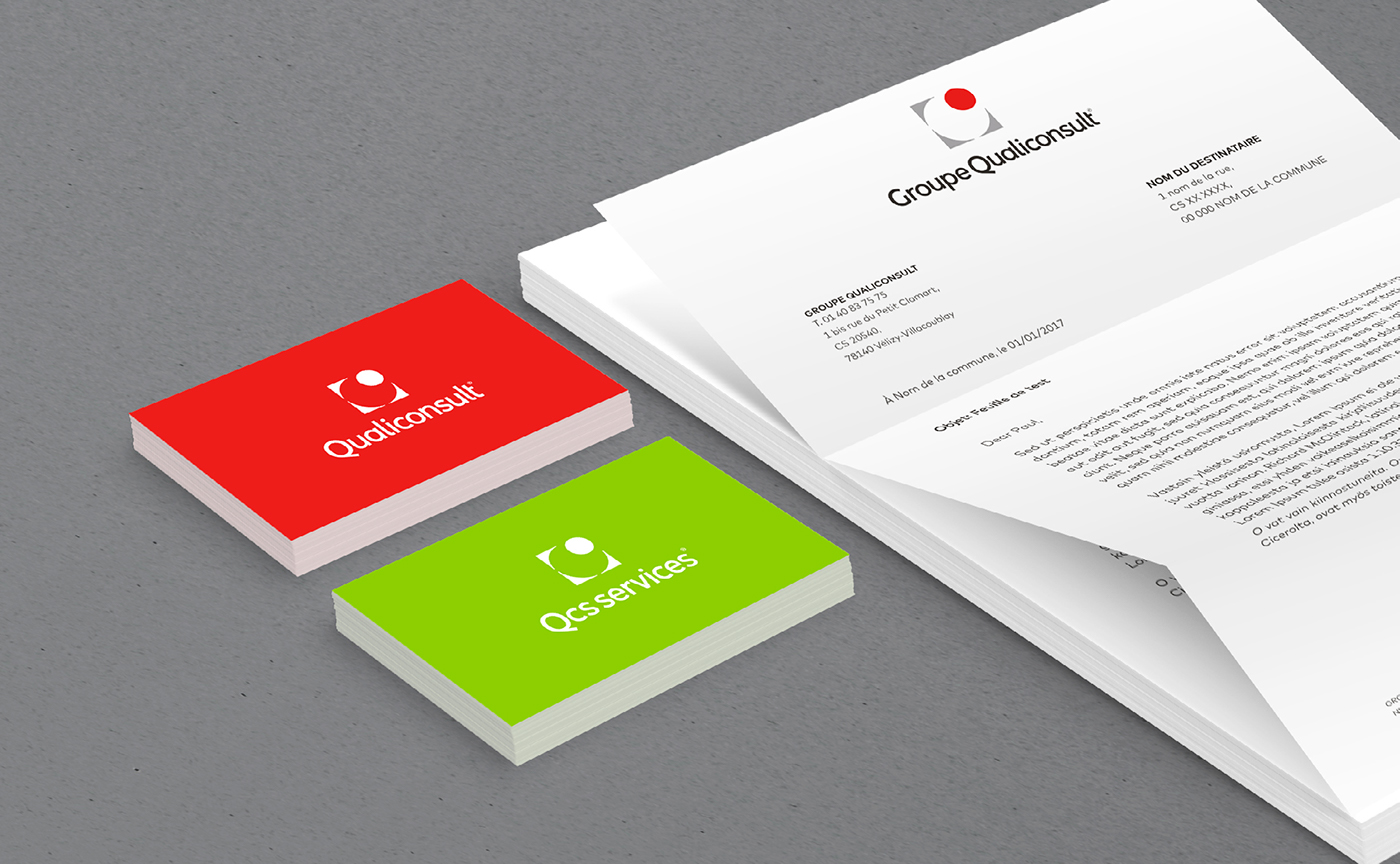
A Groupe Qualiconsult brand architecture that is better structured and more understandable to federate the teams and improve the visibility and commercial strength in a competitive environment.
A new symbol that preserves the DNA of the historic emblem while installing a clearer and more functional geometric design.
A new wordmark that imposes the name Qualiconsult in a more readable and impactful way.
A Groupe Qualiconsult brand architecture that is better structured and more understandable to federate the teams and improve the visibility and commercial strength in a competitive environment.


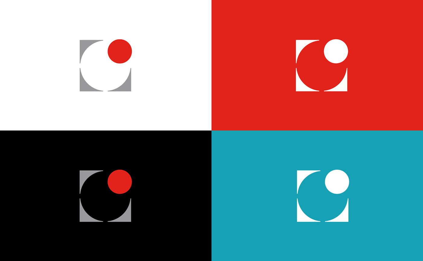
A simplified and modernized emblem
We heard many stories about the former brand icon. Some people told us it was an interpretation of the Man of Vitruve by Leonardo Da Vinci. Others argued it was a monogram of the letter "Q" and "C". Let's keep it a mystery!
The geometric shapes and straight lines of the old emblem conveyed well the idea of construction. However their entanglement gave a feeling of confusion and complexity that graphically made the logo very unsuitable for digital media. We chose to stay in touch with the old logo while freeing it from its "chains" to keep only the 4 gray corners, synonymous of "stability" and "focus", and the red circle that now symbolises the human and innovative mind of the Group.
The geometric shapes and straight lines of the old emblem conveyed well the idea of construction. However their entanglement gave a feeling of confusion and complexity that graphically made the logo very unsuitable for digital media. We chose to stay in touch with the old logo while freeing it from its "chains" to keep only the 4 gray corners, synonymous of "stability" and "focus", and the red circle that now symbolises the human and innovative mind of the Group.


A new custom typeface
We updated the brand's lettering design to get a good balance between rationality of the geometric grid and organic flexibility. The aim was to humanize the perception of the group. The New wordmark "Qualiconsult" is a custom lettering created by Graphéine. This sans-serif typeface mixes geometric and humanist tradition and replaces the old fashioned seventies look of the former avant-garde Gothic typeface set in capitals. The use of lowercases allows a better legibility of the name "Qualiconsult". The wordmark's new silhouette is now more dynamic and mindcatching. The capital "Q" supports the name and affirms the statutory aspect of the Qualiconsult brand. Particular care has been taken in the design of the letters: They are slightly condensed, which reduces the lenght of the word "Qualiconsult". Therefore the logotype becomes more functional and easier to use in small size.


Credits:
Creative direction & Art direction: Jérémie Fesson
Graphic design: Philip de Canaga, Lola Benincasa, Krystal Phan
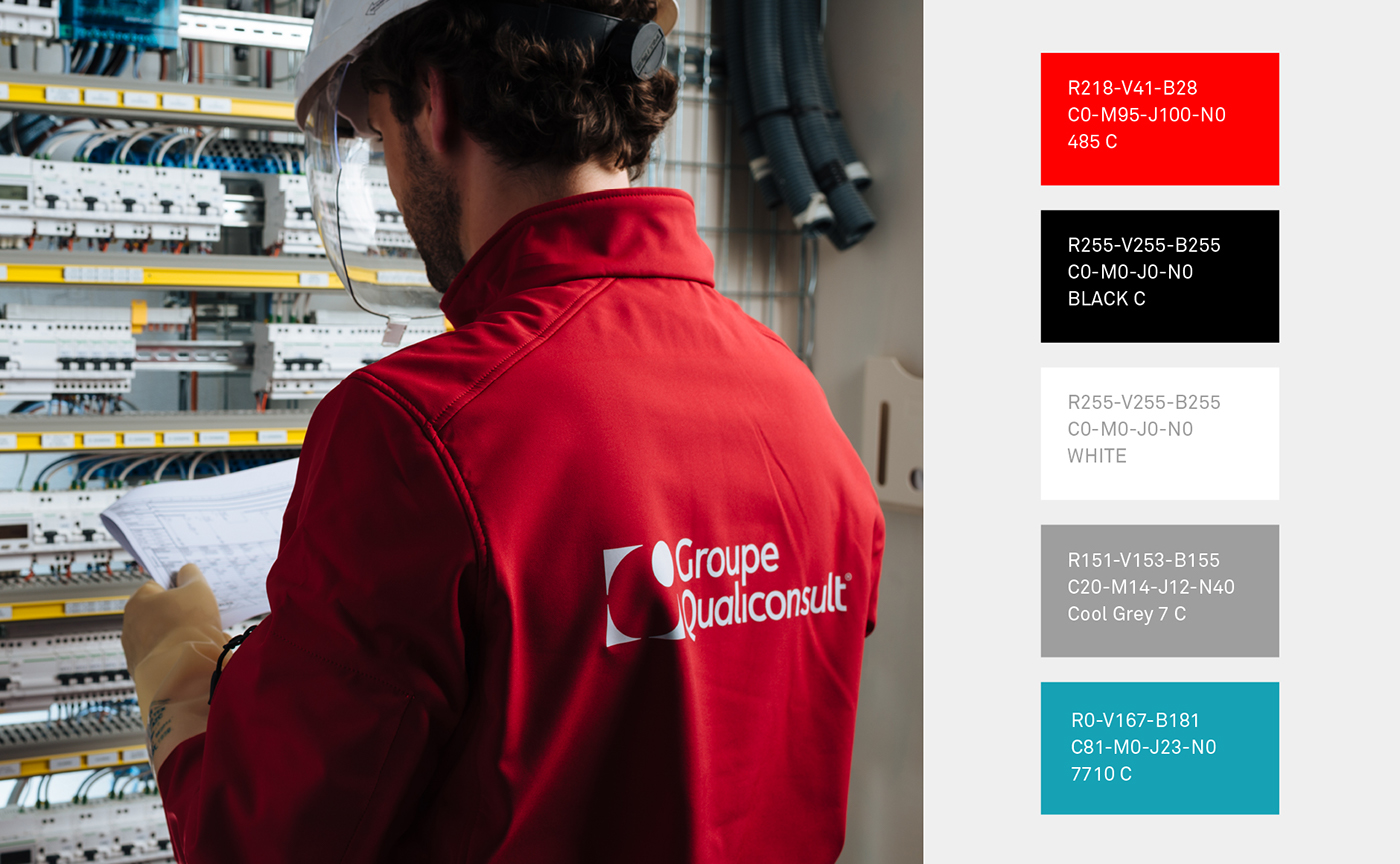
Photography: Julien Dominguez
Photography: Julien Dominguez
See more:
[EN] https://www.grapheine.com/en/portfolio/groupe-qualiconsult
[EN] https://www.grapheine.com/en/portfolio/groupe-qualiconsult


